

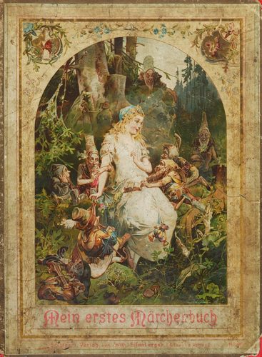
Cover art is commercial design made to wrap a single product—an album sleeve, book jacket, or magazine issue—in one image that has to work small, in a browsing bin, or as a thumbnail. Covers combine illustration, photography, typography, and layout, historically painted in gouache or airbrush on illustration board and now assembled in digital design software. A cover carries constraints a painting does not: title and credits must sit legibly over the image, a spine and barcode need reserved space, and the whole composition must read at a glance and again as a tiny icon. Genre conventions shape the look—pulp paperbacks favor bold figures and lurid color, jazz LPs favor cropped photography and clean sans-serif type, literary fiction favors restrained abstraction. The strongest covers compress mood, genre, and identity into a single frame designed to be noticed before it is read.
What defines the medium
Title and credits integration
Typography must share the frame with the image and stay legible at thumbnail size, so designers reserve clear space or high-contrast zones for title, author, and label credits before finalizing the artwork itself.
Genre signaling
Covers lean on visual shorthand—lurid color and dynamic figures for pulp fiction, cropped candid photography for jazz, dense ornament for fantasy—so a browsing eye can guess the genre before reading a single word.
Format constraints
Each medium imposes fixed dimensions: a square twelve-inch LP sleeve, a rectangular paperback with spine and back-cover copy, or a magazine trim size with a reserved logo zone at the top of every issue.
Illustration, photography, or type-only
A cover can be built from painted illustration, a single photograph, or typography alone treated as the entire image, and the choice communicates a different level of realism or abstraction to the buyer.
Series and imprint branding
Publishers and labels often standardize a grid, color band, or logo placement across an entire line so that individual titles are still instantly recognizable as belonging to the same imprint or catalog.
Thumbnail legibility
Because covers are increasingly viewed as small digital icons, designers test compositions at reduced scale, favoring bold silhouettes and high contrast over fine detail that disappears when shrunk down.
Materials decoder
The toolkit of cover art
- airbrushed gradient
- → smooth, sprayed color transitions common on pulp, sci-fi, and 1970s-80s illustrated covers
- halftone dots
- → the tiny printed dot pattern visible under magnification on offset-printed photographic covers
- reserved spine strip
- → a narrow blank band left for the book's spine text, indicating the full jacket wraps around a bound volume
- custom hand-drawn logotype
- → a title rendered as unique lettering rather than a standard typeface, used to brand a series or artist
- die-cut or foil finish
- → a raised metallic or cut-through surface treatment used on premium editions to catch light on a shelf
- cropped photographic close-up
- → a tightly framed photograph, common on jazz and literary covers, that hints at content without depicting a full scene
The story
Illustrated magazine covers flourished in the early twentieth century, with artists like J.C. Leyendecker painting long-running Saturday Evening Post covers from 1899 into the 1940s. Pulp fiction magazines used lurid painted covers to sell newsstand issues through the 1920s-30s. Penguin Books introduced a standardized color-banded grid across its paperback line in 1935, branding cheap fiction as a coherent series. Album cover art began in earnest in 1940 when Columbia Records commissioned custom illustrated sleeves in place of plain paper wrappers, giving records their own visual identity. Jazz labels refined cropped photography and bold sans-serif type through the 1950s-60s. Digital design software from the 1990s onward let cover designers combine photography, type, and illustration freely, while streaming and online retail now require covers to read clearly as small thumbnails.
Masterpieces of the medium
| Work | Artist | Date | Why it matters |
|---|---|---|---|
| Saturday Evening Post cover series | J.C. Leyendecker | 1907-1943 | long-running magazine covers painted in oil, defining early American illustration style |
| First illustrated 78rpm album sleeve for Columbia Records | Unknown | 1940 | landmark commission credited with starting album cover art as a distinct design field |
| Penguin Books paperback cover grid | Unknown | 1935 | standardized horizontal color-band system branding a whole line of cheap fiction paperbacks |
| Weird Tales pulp magazine covers | Unknown | 1920s-1930s | painted lurid illustration typical of newsstand pulp fiction covers |
| Blue Note Records sleeve design | Unknown | 1950s-1960s | cropped photography and bold sans-serif type defining a jazz label's visual identity |
 AI-generated
Try the medium
Try cover art with AI
This example was generated from a prompt like: “A retro science fiction paperback cover illustration of a lone astronaut figure against a giant painted moon, bold hand-drawn title lettering across the top, airbrushed orange and violet gradient sky, worn print texture.”
Open the Cover Art Style generator →The medium today
Cover art today is produced largely in digital design software, with designers testing compositions against thumbnail-sized previews for streaming platforms and online retail. Print-on-demand and self-publishing have widened who commissions covers, while stock photography and template-based tools speed production for smaller budgets. Series branding across formats—matching print, audiobook, and digital editions—remains a core design task, and cover reveals are now often shared as standalone social media images before a release.
Compose your own
Start by choosing the format—book, album, or magazine—since each imposes different dimensions and reserved space for title and credits. Sketch small thumbnail compositions first to test legibility before refining detail. Research genre conventions so the image signals content at a glance, then decide whether illustration, photography, or typography alone will carry the design. Build the piece in layout or illustration software, keeping type and image on separate layers so text stays adjustable. Test the finished cover shrunk to icon size to confirm it still reads clearly.
Frequently asked questions
What makes cover art different from a regular illustration?
Cover art must accommodate title text, credits, and format constraints like a spine or barcode, and it is judged partly on how well it reads at small thumbnail scale, not just as a standalone image.
Why do covers rely so heavily on genre codes?
Shoppers browse quickly, so covers use established visual shorthand—color, figure poses, typography style—to signal genre instantly, helping the right audience recognize a book or record before reading any description.
Is photography or illustration more common for covers?
Both remain widely used; illustration suits fantasy, pulp, and children's genres where invented imagery helps, while photography dominates literary fiction, memoir, and much of music packaging for its documentary feel.
How important is the spine and back cover in book cover design?
Very—on a shelf, the spine is often the only visible part, so designers extend the front cover's color, logo, or motif across the spine and sometimes the back to keep the whole jacket cohesive.