
Lettering art is the practice of drawing letterforms individually, by hand, rather than typing preset type or writing in one continuous calligraphic hand. Lettering artists sketch a letter's skeleton in pencil, then build its final shape with a brush, pen, or marker, adjusting stroke weight, serif, and flourish letter by letter until the whole word or phrase reads as a designed image. Tools range from broad-edge and pointed-pen nibs loaded with ink for calligraphic strokes, to brush pens and hand-cut brushes for bold poster lettering, to gold leaf and gum ammoniac for illuminated manuscript capitals. Because each letter is drawn rather than typed, lettering artists can widen, compress, decorate, or interlace letters freely to fit a shape or mood no existing typeface offers. A finished piece can be a single ornamented initial, a full illuminated manuscript page, a hand-painted sign, or a lettering-based poster where the words form the entire image.
What defines the medium
Letter construction and skeleton
Lettering artists first sketch the basic proportions and skeleton of each letter in pencil, establishing height, width, and stroke direction before committing to final ink, brush, or paint marks over that structure.
Stroke contrast from tool angle
A broad-edge pen held at a consistent angle naturally produces thick and thin strokes as it changes direction, and controlling that angle is central to traditional calligraphic and blackletter lettering styles.
Spacing and rhythm by eye
Because letters are drawn individually, spacing between them is judged visually rather than set by a font's built-in kerning, and consistent rhythm across a word takes deliberate practice to achieve.
Flourish and swash placement
Decorative extensions on ascenders, descenders, or terminal letters are added last, after the core letterforms are solid, so ornament enhances legibility rather than overwhelming the word.
Historical letterform models
Lettering artists often base work on established historical hands—Roman capitals, uncial, blackletter, or italic—studying their proportions and stroke patterns before adapting them to a new composition.
Integration with illustration and ornament
Lettering frequently combines with drawn borders, illuminated initials, or illustrative motifs, especially in manuscript and poster traditions, so text and image are designed as one unified composition.
Materials decoder
The toolkit of lettering art
- broad-edge nib strokes
- → thick-to-thin stroke contrast produced by a flat pen tip held at a fixed angle, the base of blackletter and formal calligraphy
- pointed-pen hairline flourish
- → delicate swelling strokes and fine hairlines made with a flexible pointed nib under varying pressure
- gold leaf illuminated initial
- → a large decorated capital letter gilded with gold leaf, marking important text in medieval manuscripts
- dense angular blackletter
- → tightly spaced, vertical Gothic letterforms used in medieval and early printed European texts
- bold brush-pen poster lettering
- → thick, confident strokes made with a flat or angled brush for large-scale sign and poster lettering
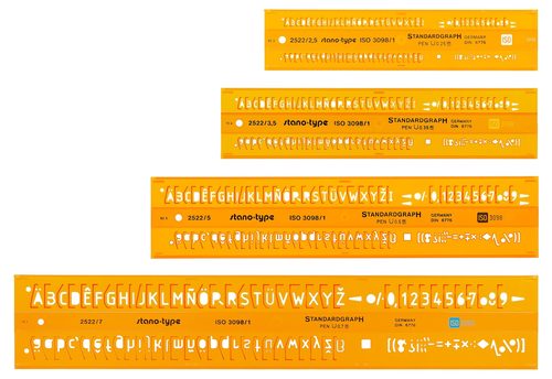
- ruled pencil guideline grid
- → faint construction lines marking letter height and baseline, visible in preparatory sketches before final ink
The story
Roman inscriptional capitals, carved around 113 CE on monuments such as Trajan's Column, established proportions still used as a model for classical lettering. Medieval monastic scriptoria produced illuminated manuscripts with elaborately decorated initials, including the Lindisfarne Gospels around 700-720 CE and the Book of Kells around 800 CE. Gothic Europe developed dense blackletter hands for both manuscripts and early printed books. The Arts and Crafts revival of the late nineteenth century, led in part by William Morris's Kelmscott Press from 1891, reintroduced ornamental hand-drawn lettering and borders to printed books. Edward Johnston designed a custom sans-serif lettering system for the London Underground in 1916, influencing twentieth-century signage design. Commercial sign painting and logotype design carried hand lettering through the twentieth century, and a digital hand-lettering revival has grown online since the 2010s using brush pens and styluses.
Masterpieces of the medium
| Work | Artist | Date | Why it matters |
|---|---|---|---|
| Book of Kells | Unknown | c. 800 CE | illuminated Gospel manuscript with intricate interlaced decorated initials |
| Trajan's Column inscription | Unknown | 113 CE | carved Roman capital letterforms later used as a model for classical lettering |
| London Underground lettering system | Edward Johnston | 1916 | custom sans-serif lettering created for London transport signage |
| Lindisfarne Gospels | Unknown | c. 700-720 CE | illuminated manuscript with elaborate decorated initials and carpet pages |
| Kelmscott Press title pages and borders | William Morris | 1891-1896 | revival ornamental lettering and borders for private press books |
 AI-generated
Try the medium
Try lettering art with AI
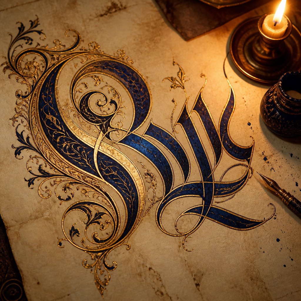
This example was generated from a prompt like: “An ornate hand-lettered word rendered in gold leaf and deep blue ink on aged parchment, thick-and-thin calligraphic strokes with interlaced decorative flourishes framing the first letter, warm candlelit lighting.”
Open the Lettering Art Style generator →The medium today
Lettering art today thrives on tablets and styluses alongside traditional pen, brush, and paper, with digital brush-pen apps letting artists build letters stroke by stroke much as they would by hand. Hand-lettering communities share process videos of sketching, inking, and refining a single word, and commissioned lettering appears widely in branding, wedding stationery, book covers, and murals. Formal calligraphy and illuminated-letter techniques persist in specialty workshops alongside a broader casual hand-lettering hobby movement.
Compose your own
Start with basic pen or brush practice, learning consistent stroke pressure before attempting full letterforms. Study one historical or contemporary alphabet style and copy its letter skeletons repeatedly to internalize proportion and rhythm. Sketch guideline grids in pencil to keep height, baseline, and slant consistent across a word, then build up final strokes in ink, brush, or marker over that structure. Practice spacing by eye, comparing the gaps between letters until the word reads evenly, and only add flourishes once the core letterforms are solid.
Frequently asked questions
Is lettering art the same as calligraphy?
They overlap but differ: calligraphy is typically written in one continuous flowing hand following a consistent script, while lettering art draws each letter individually and can freely adjust proportions letter by letter.
What tools do beginners need to start hand lettering?
A pencil for sketching, a ruler for guidelines, and either a brush pen or a broad-edge calligraphy marker are enough to begin; more advanced work later adds dip pens, ink, and gouache.
What is an illuminated initial?
An illuminated initial is a large, elaborately decorated capital letter, often gilded with gold leaf, used at the start of a chapter or important passage in medieval manuscripts to mark and beautify the text.
Can lettering art be done digitally?
Yes—many lettering artists now sketch and ink letterforms on a tablet using a stylus and pressure-sensitive brushes, following the same construction and spacing principles as traditional pen-and-paper lettering.