
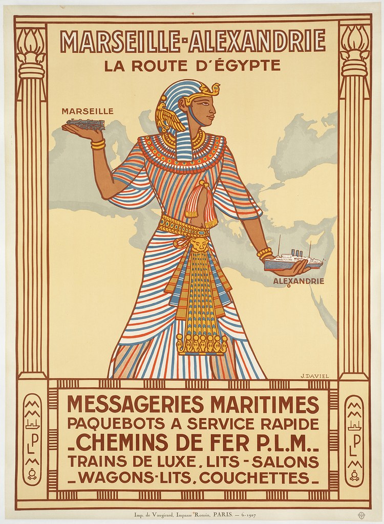
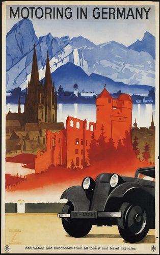
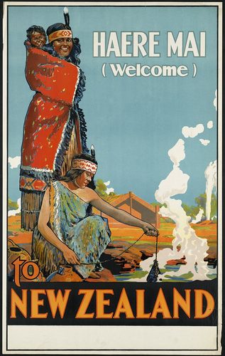
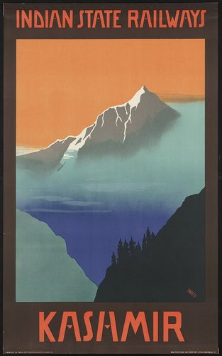
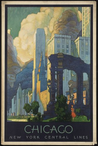
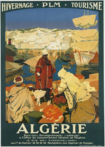
Poster art is a printed graphic medium built to communicate instantly from across a street or platform, fusing image, color, and lettering into one flat composition. Most historic posters were produced by chromolithography, a process where an artist draws directly onto limestone or zinc plates, one stone per color, so the finished print is built from flat, separated fields of ink rather than blended paint. This technical constraint shaped the look: bold outlines, limited color palettes, and simplified forms that read clearly at a glance. Typography is treated as part of the image, not an afterthought, with lettering styles matched to the mood of the message. Paper stock ranges from cheap newsprint for wartime bills to heavier coated sheets for commercial display. Later poster art added offset printing and screenprint, expanding color range and speed. Whether selling cabaret nights, war bonds, or travel destinations, a poster succeeds by compressing a message into one arresting image meant for public walls and kiosks.
What defines the medium
Flat color separation
Historic posters were printed by chromolithography, with a separate stone or plate inked for each color. This process produces flat, evenly saturated fields of ink rather than blended tones, with no gradients between colors.
Integrated typography
Lettering is designed as part of the image rather than added afterward, often hand-drawn to match the poster's mood. Typeface, size, and placement carry as much visual weight as the illustration itself.
Legibility at a glance
A poster has to communicate in seconds to someone walking or riding past, so designers favor bold outlines, high contrast, and simplified shapes over fine detail. Complexity is stripped away for instant recognition.
Large-format printing
Posters are printed at sizes meant for public walls, kiosks, and hoardings, often several feet tall, and produced in runs of hundreds or thousands rather than as single unique objects. Standard sizes evolved for outdoor pasting.
One message, one image
Effective posters compress a single idea—buy this, enlist now, visit here—into one dominant image and a short line of text. Designers avoid clutter, trusting one strong visual to carry the entire message.
Cost-driven limited palette
Because each additional color meant another printing plate and added expense, poster designers historically worked with a restrained palette of three to six colors, turning a production limit into a distinctive style.
Materials decoder
The toolkit of poster art
- chromolithographic flat fields
- → large areas of single, uniform ink color with no blending, the signature look of stone-printed posters
- bold black contour line
- → a heavy outline separating color shapes, common where a keyline plate defined edges before color was added
- hand-lettered display type
- → custom-drawn lettering styled to match the poster's subject, distinct from standard printed typefaces
- screenprint ink layer
- → a slightly raised, matte layer of ink from silkscreen printing, used on posters from the mid-20th century onward
- creased or pasted paper texture
- → fold lines, pinholes, and paste residue on surviving originals from being mounted on outdoor walls and kiosks
- oversized sheet format
- → large paper dimensions, often several feet across, sized for visibility at a distance rather than close viewing
The story
Poster art emerged with the spread of lithography in early 19th-century Europe, which allowed images to be printed cheaply in large runs. Jules Chéret pioneered three-stone color lithography in Paris in the 1860s, producing vivid theater and cabaret bills. Henri de Toulouse-Lautrec elevated the poster to fine art with his Moulin Rouge designs of the 1890s, and Alphonse Mucha's flowing Art Nouveau figures defined the style's decorative peak. Both World Wars turned posters into tools of state persuasion, recruiting soldiers and rationing goods with bold graphic slogans. The 1920s and 1930s saw streamlined travel and transport posters promoting rail and steamship lines. Offset printing gradually replaced hand-drawn lithography after mid-century, and screenprinting brought posters into 1960s music and protest culture. Digital design now dominates production, though collectors continue to prize hand-lithographed originals.
Masterpieces of the medium
| Work | Artist | Date | Why it matters |
|---|---|---|---|
| Moulin Rouge - La Goulue | Henri de Toulouse-Lautrec | 1891 | color lithograph credited with elevating poster design to fine art |
| Job | Alphonse Mucha | 1896 | Art Nouveau cigarette-paper advertisement with flowing decorative lines |
| Lord Kitchener Wants You | Alfred Leete | 1914 | British recruitment poster with a direct pointing figure and bold slogan |
| Power: The Nerve Centre of London's Underground | Edward McKnight Kauffer | 1930 | modernist transit poster built from flat geometric color shapes |
| Folies-Bergère | Jules Chéret | 1890s | early color lithograph promoting Parisian entertainment venues |
 AI-generated
Try the medium
Try poster art with AI
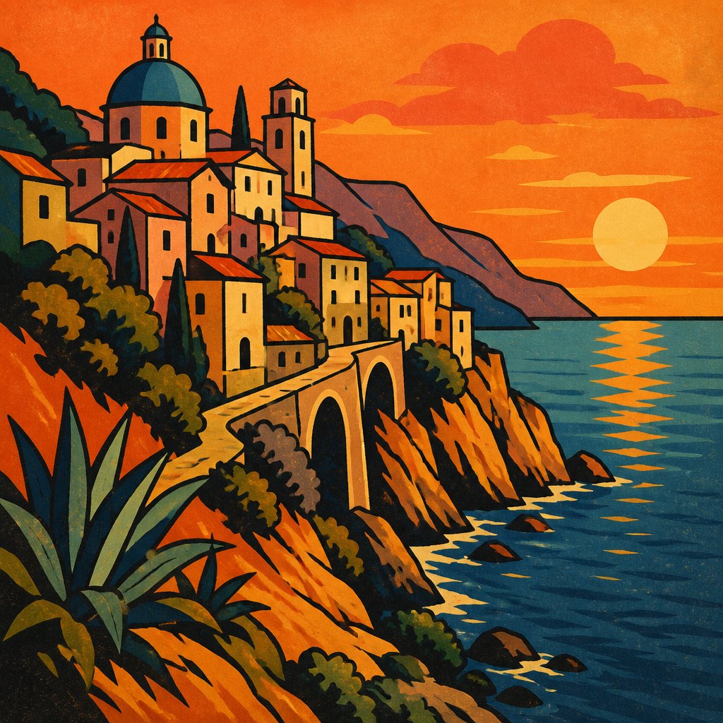
This example was generated from a prompt like: “A vintage-style travel poster of a coastal cliffside town, flat saturated colors, bold hand-lettered title, simplified shapes with heavy black outlines, warm sunset palette, printed lithograph texture.”
Open the Poster Art Style generator →The medium today
Poster design today runs largely on digital tools, with vector illustration software replacing hand-drawn lithographic separations. Offset and large-format inkjet printing produce most commercial posters, while screenprinting survives for limited-run music and film posters valued for their tactile ink layers. Museums and archives actively collect vintage posters as historical documents of advertising and propaganda. Poster-style graphics also thrive purely digitally now, used across social media as compressed, single-image advertisements.
Compose your own
Starting in poster design means thinking in flat shapes rather than blended tones: choose a limited palette of three to five colors and block in large simple areas before adding detail. Sketch a strong single image paired with a short line of text, then treat the lettering as part of the composition, drawing or selecting a typeface that matches the mood. Vector illustration software makes it easy to work in flat, separated color the way lithography once forced designers to. Study historic posters for how they simplify complex scenes into a few bold shapes, and test the design at a small size to check that it still reads clearly from a distance.
Frequently asked questions
What made lithography important for poster art?
Lithography let artists draw directly onto a stone or plate and print it in large, affordable runs, making mass-produced color images possible for the first time and turning posters into an everyday commercial medium.
Why do vintage posters use so few colors?
Each color required its own printing stone or plate, so more colors meant more cost and printing time. Designers worked around this limit by using flat, carefully chosen palettes rather than full-color blending.
What's the difference between a poster and a print?
A poster is designed to communicate a message quickly in a public setting and produced in large commercial runs, while a fine art print is often a smaller edition made primarily for display and collecting.
Are original vintage posters valuable?
Surviving originals from limited early print runs, especially Art Nouveau and wartime propaganda posters, are collected by museums and private buyers, with condition, rarity, and reputation driving their value.